
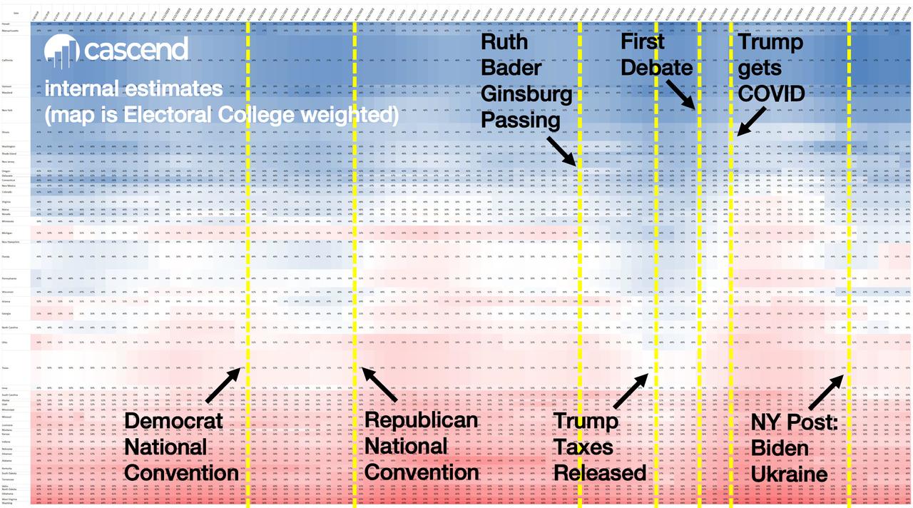
"This is the same data, but as the complete form which suits data scientists and investors best: our Electoral College daily probability heat map
- It is a very clear way to see the daily changes in election probabilities, particularly how major events change the probability landscape and which states cause the changes
- Each of the columns is a day (ending October 18th)
- Each row is a state, with the height of the state’s row/cells determined by the relative number of electoral votes (i.e. California’s row height is much higher than Maine)
- This gives an easy visual reading for Electoral College voting likelihood
- Blue for Biden, Red for Trump
- The color intensity is based on the win/lose spread – white is “undecided” (exactly 50/50)
- You can easily see how events in the 2020 election impact daily voter sentiment for the two candidates
- Data is based on our consumer sentiment technology"

at https://www.zerohedge.com/markets/cascend-most-important-chart-2020-election
No comments:
Post a Comment