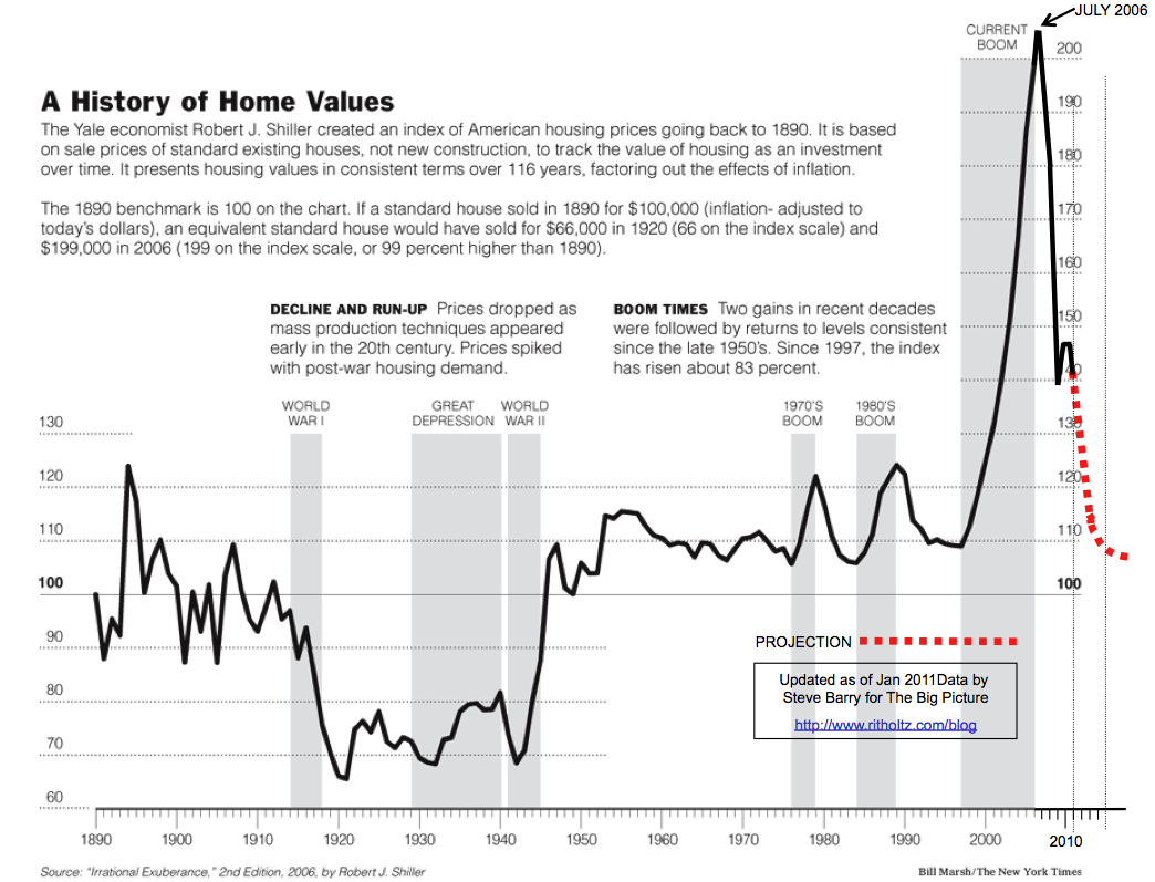
Two years later, TBP reader Steve Barry updated that graphic, including the projected Home Price mean reversion. (See versions for 2008, 2009 and 2010).
Its time to update this for 2011. Note the 2009 tax credit wiggle:..."
>

>
at http://www.ritholtz.com/blog/2011/04/case-shiller-100-year-chart-2011-update/
No comments:
Post a Comment