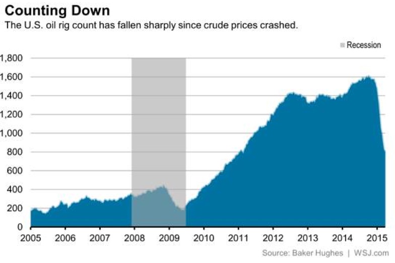
Below is a chart from WSJ showing the U.S. oil rig count has collapsed since the price of oil crashed.
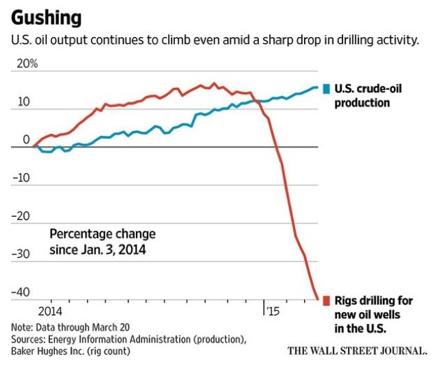
Below is a chart from the Wall Street Journal showing the U.S. oil output continuing to climb, even as the rig count collapses.
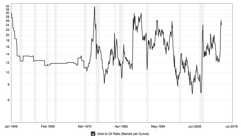
Below is a chart that illustrates a 50-year look at the Gold/Oil ratio. Notice how the ratio has moved decisively in favor of gold. This is a positive development for gold and the gold mining shares.
The chart below from WSJ is quite remarkable. It shows the price of iron-ore has now collapsed below the previous low set at the bottom of the financial panic of 2009.
All of these charts show just how turbulent the commodity markets have been (mostly on the downside), even as the central banks around the globe have flooded the world with unprecedented amounts liquidity."
at http://kingworldnews.com/4-of-the-most-remarkable-charts-of-2015/


No comments:
Post a Comment